Sunday, October 25, 2009
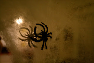
Don't be scared.
I took this in honor of Halloween - I decorated my apartment with a few gimmicky decorations and thought I should photograph them in all their spooky splendor. Don't be scared, they are only plastic.
"You didn't wash your necks." "Sometimes we don't wash our necks, but that's ok." "I...wash my neck...take a look at my neck!"
These are some images from a Flash interactive I did over the summer, on the major structures of the neck. I will link to the actual interactive when possible, but for now chew on this.
Monday, October 19, 2009
Wednesday, October 14, 2009
Watch it baby.
So I have been tied up with some larger projects these days, so I figured I will post up some progress of them. For my Maya class this semester, our big final assignment is to create an environment (anything you want) and then render out the scene with textures and lighting, plus have a camera fly through. I wanted to do something medically-based that will hold my interest for the whole semester, so I decided to recreate what two fraternal twins would like in their mother's womb (fyi I am a fraternal twin with my brother (see below) so there is an obvious correlation here).
Moving on, below is a screen shot of my baby, the beginning of what will be two babies in the womb. Woop.
Moving on, below is a screen shot of my baby, the beginning of what will be two babies in the womb. Woop.
Saturday, October 10, 2009
ERIN'S HEART & SOUL
Wednesday, October 7, 2009
So I lied a little...
Below you will find my final versions of the medical icons for my most recent Advanced Graphic Design project. We had to choose three medical branches, and I, of course, chose Psychiatry as my last branch which certainly was freakin hard to represent. So my three branches were Ophthalmology, Nuclear Medicine and Psychiatry. While I was brainstorming, I figured I would call my last branch Neurology, because that's exactly what the icon looked like. However, I developed (I hope) a more representative icon for Psychiatry, although at one point I was ready to accept my current very Neurological-type icon. By the way, we had to develop a color version of the icons as well. We could use as much or as little color as we wanted, so I wanted to highlight the 'smaller' parts of the major structures that I created.
Friday, October 2, 2009
Frank Armitage Lecture coming up!
Frankie boy. Mr. Frank Armitage will be featured again this year, on October 22nd and 23rd, at the annual BVIS event The Frank Armitage Lecture. David Bolinsky, Medical Director and Partner for XVIVO, will be the guest lecturer. Site creation and design for the event was done by my fellow classmate Lindsey Pionek.
Thursday, October 1, 2009
"The Birds"
A screen grab of a website design and creation that I am doing for a friend of mine, Ms. Erin Stevens. Simple and clean. We'll see how coding it goes!


Le babies

Presenting my first real-life edited photograph! (It's the little things in life...) I adjusted hue/saturation, shadow/highlight, applied a photo filter and performed other small minor manual alterations. Woop! The subject is one of the many succulents I have flanking my kitchen windows. They are called 'Hens and Chicks' and they are cute little fellows aren't they? If you look close at the red glass stone on the far upper-right, you can actually see me - my hands and head surrounding the big black camera lens. Very cool. Unintentional, but nice nonetheless.

I CON CREATE ICONS.
Our most recent project for advanced graphic design was to create icons for three branches of medicine. I started with a very flat, graphic style, but as I went on I really let my imagination take me where it wanted. The second idea I came up with is very 60's, and completely different from the other icons. For the last design, I wanted something bold and striking. So, below are the three very different styles I developed. If you prefer one, PLEASE let me know, because I have to pick one to finalize for the final hand in. (Click to enlarge in new window!)


Subscribe to:
Posts (Atom)


